Friday, 30 March 2012

Final Evaluation


In what ways does your media product use, develop or challenge forms and conventions of real media products?
Our media product uses forms and conventions from real media products to see what has been done successfully in the past and what has been done not so successfully. This was to see what fans of the genre would be interested in being seen again and what they liked before and then to change the things that they did not like done before. Our product challenges the forms and conventions of real media products to judge how we should create our product to appeal to our target audience and to also push the conventions of the genre to make our film different to films of the same genre that have been made in the past. To discover some of the forms and conventions of a film title sequence we looked into the title sequences of other films of a similar genre. We did this to see how the film company had done the title sequence to their film and then decided if we wanted to carry any of the forms shown in the title sequence or not. For example, in the title sequence to the 2008 film ‘Defiance’ they make the beginning of the titles to resemble real news or propaganda footage of the time. This inspired us to use some news footage of John F. Kennedy during his inaugural speech. This, like the ‘Defiance’ opening titles was to give the audience a feel of when the film is set.

How does your media product represent particular social groups?
Our media product represents particular social groups in a fair and unbiased way. Considering the film idea of for our title sequence is based around the Cold War in the 1950’s we decided that we did not want to take the side of one country involved in the war. We wanted to make sure that our title sequence represented each country involved in a unbiased way to not alienate a certain audience from viewing the film. Our title sequence does not go too far into social groups to properly represent them but does allow you to know that the characters involved were not part of everyday society.

What kind of media institution might distribute your media product and why?
The kind of media institution that might distribute our media product would be Universal Pictures. We decided that they would be the appropriate distributor for our film because of some of their film choices in the past and the budget spent on these films. We looked deeply into the budgets and genres of films that many distributors take on for films and then the final outcome we got was Universal Pictures.

Who would be the audience for your media product?
The audience for our media product would be 18-40 year old males and maybe even men of an older age. The film would most attract people who were interested in the Cold War and would like to see another angle on it. It would also appeal to people from around the world as it doesn’t show either America or Russia in a bad light without showing the other in the same light. This is to not make the film aimed at either an American or Russian audience. We selected the target audience of primarily 18-40 year olds as it is not a straight forward action thriller but also involves a lot of thought and some wisdom behind the history and social context of the film. It is also because the audience would have to make up their own mind as to who they think the organisation within the film is really with.

How did you attract/address your audience?
We attract/address our audience by using both big name actors as well as a story that is known amongst the general viewing audience but with the twist of the possibility of showing a part of the story that people may not know. We use a big name actor like Leonardo DiCaprio playing the lead role as this would attract many of his fans to go and see a film they would not otherwise see if he was not starring. We also used the actress Rosie Huntington-Whiteley as she is currently a big name actress and recently starred in the third Transformers film and so she could bring some fan base from that franchise to this product. We also selected a story which would allow many people to want to see as it would give a new insight of the Cold War.

What have you learnt about technologies from the process of constructing this product?
From the process of constructing this product I have learnt the easier and some of the more difficult ways of using the editing software we were given to use. The first editing software I learnt how to use properly during the process was Adobe Photoshop. This was used to create some initial mock ups for the typographies used in the title sequence. The other editing software I learnt how to use was Final Cut Pro. This was used to create the final product. This helped us create our final product and get it to a better standard that we would have achieved on iMovie or another editing programme.

Looking back at your preliminary task, what do you feel you have learnt in the progression from it to the full product?
Looking back at our preliminary task, I can see that our work has greatly improved. This could be due to our use of a better editing program and a lot more planning and preparation going into the shooting and editing. One thing we have learnt during the progression from our preliminary task to our full product is that planning is a big thing before shooting and also a lot of co-operation between the team is needed to make filming and editing easier. We struggled a lot when it came to the preliminary task because we struggled to decide on a lot of aspects of our piece and we then had to rush to complete our shooting so that we could have it filmed and edited in time. We also learnt throughout both processes of the preliminary task and final product that we would have to work as a team and take on everybody’s ideas and not make people feel as though they are not a big part of the group. Even if it means not likely a particular aspect of the piece it helps to show everybody’s involvement within the title sequence.


Thursday, 29 March 2012

The Iron Curtain- Finished Title Sequence


This is the finished title sequence for our film 'The Iron Curtain'. We got to this result by taking on some of the feedback given to us through the feedback sheets. We had to remove a sequence that involved John F. Kennedy as we were way over the maximum time allowed and so we had to cut that along with the original Universal Studios sequence.

Journal- Audience Feedback 3


Here are our audience feedback forms for our title sequence. These feedback forms would assist us in making any amendments to our title sequence. These forms came very much in handy in making any changes to our title sequence as there were many parts we didn't think worked very well and it was good to get some reassurance on these parts of the title sequence.

Friday, 24 February 2012

Location Shots

During the filming of our title sequence one member of our group decided it would be useful for him to spend the whole time taking images of our surroundings for location shots. This meant that he did not fully co-operate in the filming of, or preparation of, our title sequence.
Cemetery filming


Church Filming


Monday, 23 January 2012

Shot list january 24th/26th

Due to me not being able to assist in filming for two days due to arrangements with other subjects I felt that it would be fair of me to still make some contribution to the days filming so I wrote this shot list so that the rest of my group could smoothly do the filming.


Tuesday January 24th filming shot list

1.     Shot of the mysterious characters upper body looking out of a window.
2.     Same angle but close up of the mans head.
3.     Reverse shot showing the mysterious characters face in the foreground with the other man out of focus in the background, the mans face then goes out of focus as the other man comes into focus.
4.     Wide shot showing the original man approach ‘window’ man carrying the suitcase he had earlier stolen.
5.     mid shot of ‘window’ man turning to face ‘other’ man.
6.     Close up of the suitcase being based hand to hand.
7.     Close up of ‘window’ man acknowledging the suitcase


Other shots
1.     Close up of a drinking class with alcohol being poured in.
2.     Extreme Close up of mans mouth as he takes a drink.


Thursday January 26th filming shot list
  1. Extreme wide shot from behind our main character showing the setting
  2. Close up of the characters torso (tracking)
  3. Close up on the characters feet (tracking)
  4. Close up of the characters hands (tracking)
  5. Close up of the back of the characters head (tracking)
  6. Extreme close up of the characters mouth (tracking)


Saturday, 21 January 2012

Journal: 21st January- Location Issues

During the past week we have faced 2 issues with our locations. One issue being the setting not suiting the era of our film and the other being due to a member of our groups religion not allowing us to film in this church. This member of the group had also delayed filming in the past due to having issues with how the storyboard role was distributed amongst the group meaning we were pushed back a week to organise who did the storyboard and then making the storyboard.

We did over come these issues and found a church near our school which would eb the perfect location for these scenes.

Friday, 20 January 2012

Journal- Audience Feedback 2

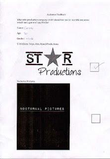
Due to some debate about our production company logo we produced another audience feedback sheet and this time asked 26 people to express their opinion on the two production company logos we had created. One logo being for 'S.T.A.R Productions' and the other being for 'Nocturnal pictures'. After we got our feedback we counted a different of 20 votes for 'Nocturnal Pictures' and 6 votes for 'S.T.A.R Productions'. This made it very clear to use which logo we would use and so have gone for the 'Nocturnal Pictures' logo.


S.T.A.R Productions


Nocturnal Pictures 


Although it is not clear by the chosen feedback forms the final result was the 'Nocturnal Pictures' logo. The logo won by a landslide victory coming in at 75% of people voting for 'Nocturnal Pictures' and only 25% for 'S.T.A.R Productions.


Journal- Music and Sound

In todays lesson both I and another member of my group looked at various music clips and texture effects for our title sequence audio. Deciding on the music for the sequence ended up being easier than we had originally thought it would be and we had decided on a track for the clip in around an hour. The track we had decided upon was called 'Princes in the Tower' and was taken from the copyright free music website we had been supplied by our teachers.
Here is the link to the audio. https://audionetwork.lgfl.org.uk/production-music/princes-in-the-tower_5059.aspx
We then started using 'Garage Band' to help use find some background sound for the title sequence.

Journal- Filming

On Monday 16th January we begun filming our title sequence in a corridor around the school.
Here is an example of the footage we filmed.


After looking over the footage we filmed we decided that maybe the footage needed to be reshot in a different location as even though we had tried our best to hide that it was filmed in a school we struggled to hide that it was still a modern setting rather the the 1950's/60's era we are aiming to achieve from the title sequence.

Journal- Audience Feedback


To decide our final typography decision we created a table in which 4 members of our target audience could vote for which font looked best for our title sequence. To our luck the 4 people we asked all picked the two fonts we most liked as a group and so our decision for the two fonts was made even easier and we decided upon our two fonts. 

The audience feedback sheets helped us greatly to decide upon our font as we then knew which fonts we liked and which fonts most appealed to members of our target audience.

Wednesday, 18 January 2012

Journal- Wednesday 18th January- Editing

In today's lesson we began working on editing our title sequences. We begun the lesson with a demonstration on the basics of how to use 'Final Cut Pro' which would assist us in editing our final film. We used the footage that we had filmed earlier in the week whilst going through this. Before we could put the footage onto 'Final Cut Pro' we had to convert the footage on 'MPEG Streamline'.

Friday, 13 January 2012

Journal: Friday 13th January- Typography

The typography of our blog was something we felt was fairly important to the story behind our film. one of our decisions was to use two typographies for the film. Each typography would represent a different side to the Cold War. One typography being a very American style font and the other being a very Russian styled font.
Here are the two chosen fonts we have decided to use.


Friday, 6 January 2012

Journal: Friday 6th January- Google Calendar

In todays lesson we set up our google group calendar which would help each member of our group with some communication issues that had arose during some previous lessons. We set up our Google group calendar and we can now keep in touch with everyone in our group and set certain tasks to be done for certain days which help us to move on quicker in lessons by having either prepared before lesson or gone ahead out of lesson.

Thursday, 5 January 2012

Journal- January 5th- Storyboard animatic


Here is the video animatic of our storyboard for our title sequence. Sadly most of the images in the animatic are blurred and haven't been edited together properly to encorporate the times but instead are just the default lengths set by iMovie.

Wednesday, 4 January 2012

Journal: Wednesday 4th January- Storyboards

In Wednesday's lesson we began work on our storyboard that we would need to make our title sequence.

So that we knew what we had to film and edit we have had to create a storyboard for our title sequence idea. We have had to take in mind the edits/transitions we will be using, the movement of the camera and on screen elements and also the sound featured in each shot.

Once we have finished our storyboards we will be adding them to either iMovie or Final Cut to make an animatic which will help show the timing of our title sequence idea.

After some issues involving a member of our group not thinking the jobs were shared out equally we split the storyboard into 4 sections and gave each member of our group a quarter of the storyboard which was then their responsibility to bring in when needed.

These are the storyboards:


Monday, 2 January 2012

Journal- production plan

Our main aim is to have the bulk of our title sequence filmed and ready to edit by mid january. This will give us about a month to edit our footage ready to get feedback from our class to make any changes for our March 30th deadline.

We would also like to have most of our text ready to be imported into Final Cut Pro before we begin filming. This along with our storyboards will help us move further in filming at a quicker rate.

Journal: Monday 2nd January- Typography, Title Sequence

In December we began work on deciding ideas for our title sequence.
We began by deciding upon a storyline and plot for our film. We then pitched our film ideas to the class and used the feedback to decide whether we would keep that idea. After we had decided on the film plot we went about deciding upon a title sequence for our film.

One of the first decisions about the title sequence we made after getting our idea was the typography. Because our film is set during the Cold War and shows both America and Russia during the war we decided on having two typographies, one in a Russian style font and the other in an American style font.

Wednesday, 7 December 2011

www.smashingmagazine.com- 3 Points


Film titles and letter cards had to provide essential information to the viewer. For reasons such as ease of production and clarity, artists favored mono-stroke letterforms or characters with small serifs. White lettering on a black background is another characteristic of this era, because titles simply looked better this way when projected with live-action B&W film.
This shows how, in the early stages of the film industry, title sequences and letter cards were vital to a film to help the audience understand the plot and story of the film. Without dialogue it was very difficult to understand some elements of the film and so titles and letter cards would help the audience to connect to the film.

As movies grew more popular, their titles evolved. Movie producers invested considerable sums in film production and sometimes resorted to fixing a dog of a film by rewriting the inter-titles. For a time, “film doctor” Ralph Spence (1890–1949) was the highest-paid title writer in the industry, earning $10,000 a picture for his one-liners.

This shows how important film titles got the more popular films got in the early 1900's. Ralph Spence would earn $10,000 for doing the titles and letter cards for one film and due to him being a popular title writer meant he could earn even more than that in one year, showing the importance of title sequences in early films.

During the 1920s and ’30s, European cinema was deeply influenced by modernism, and aspects of this visual sensibility were brought to the US by filmmakers who were fleeing the Nazis. Meanwhile, the studio systems operating in Europe and Hollywood also delighted in creating titles that featured vernacular graphic novelties. As much as possible, they liked to convey the tone of a movie through the “dressage” of its main title. Thus, blackletter fonts in the opening credits were used to evoke horror, ribbons and flowery lettering suggested love, and typography that would have been used on “Wanted” posters connoted a western flick.

This discusses how, during the 1920s and '30s, film makers began to make their opening titles more suited to the genre and plot of the film. It shows how film makers began to realize the potential of relating a title sequence to the film and how it can help an audience understand the mood and context of the film before it has even really began.


Paramount Vantage- Studio Presentation

Paramount vantage

This is the presentation me and Alex Flynn created together for our pitching task 

Tuesday, 6 December 2011

Defiance opening sequence


The opening sequence of the film 'Defiance' begins with various real black and white footage of real life events during the Second World War and also some footage that has been specially made for the film. The title sequence then changes from black and white into colour as Nazis invade a Polish town and take members of the town away with them.

During the black and white parts of the sequence various facts about the Nazis and the Jews during the Second World War would appear as white text on a contrasting black background. Later in the sequence, during the black and white parts, the film company and title appear over the action happening on screen.

This title sequence makes it apparent that it is for a war film but using facts about the war and footage from the time which almost acts as a prologue for the rest of the film as it gives the audience a bit of background history for the war which allows the audience to understand some of the history behind the film.

These could fit well into the title sequence for our film as it could also be used to give the audience some historical background of the cold war and the rivalry between America and Russia.