Monday 23 January 2012

Shot list january 24th/26th

Due to me not being able to assist in filming for two days due to arrangements with other subjects I felt that it would be fair of me to still make some contribution to the days filming so I wrote this shot list so that the rest of my group could smoothly do the filming.


Tuesday January 24th filming shot list

1.     Shot of the mysterious characters upper body looking out of a window.
2.     Same angle but close up of the mans head.
3.     Reverse shot showing the mysterious characters face in the foreground with the other man out of focus in the background, the mans face then goes out of focus as the other man comes into focus.
4.     Wide shot showing the original man approach ‘window’ man carrying the suitcase he had earlier stolen.
5.     mid shot of ‘window’ man turning to face ‘other’ man.
6.     Close up of the suitcase being based hand to hand.
7.     Close up of ‘window’ man acknowledging the suitcase


Other shots
1.     Close up of a drinking class with alcohol being poured in.
2.     Extreme Close up of mans mouth as he takes a drink.


Thursday January 26th filming shot list
  1. Extreme wide shot from behind our main character showing the setting
  2. Close up of the characters torso (tracking)
  3. Close up on the characters feet (tracking)
  4. Close up of the characters hands (tracking)
  5. Close up of the back of the characters head (tracking)
  6. Extreme close up of the characters mouth (tracking)


Saturday 21 January 2012

Journal: 21st January- Location Issues

During the past week we have faced 2 issues with our locations. One issue being the setting not suiting the era of our film and the other being due to a member of our groups religion not allowing us to film in this church. This member of the group had also delayed filming in the past due to having issues with how the storyboard role was distributed amongst the group meaning we were pushed back a week to organise who did the storyboard and then making the storyboard.

We did over come these issues and found a church near our school which would eb the perfect location for these scenes.

Friday 20 January 2012

Journal- Audience Feedback 2

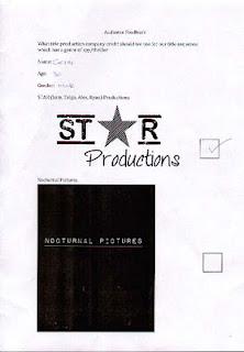
Due to some debate about our production company logo we produced another audience feedback sheet and this time asked 26 people to express their opinion on the two production company logos we had created. One logo being for 'S.T.A.R Productions' and the other being for 'Nocturnal pictures'. After we got our feedback we counted a different of 20 votes for 'Nocturnal Pictures' and 6 votes for 'S.T.A.R Productions'. This made it very clear to use which logo we would use and so have gone for the 'Nocturnal Pictures' logo.


S.T.A.R Productions


Nocturnal Pictures 


Although it is not clear by the chosen feedback forms the final result was the 'Nocturnal Pictures' logo. The logo won by a landslide victory coming in at 75% of people voting for 'Nocturnal Pictures' and only 25% for 'S.T.A.R Productions.


Journal- Music and Sound

In todays lesson both I and another member of my group looked at various music clips and texture effects for our title sequence audio. Deciding on the music for the sequence ended up being easier than we had originally thought it would be and we had decided on a track for the clip in around an hour. The track we had decided upon was called 'Princes in the Tower' and was taken from the copyright free music website we had been supplied by our teachers.
Here is the link to the audio. https://audionetwork.lgfl.org.uk/production-music/princes-in-the-tower_5059.aspx
We then started using 'Garage Band' to help use find some background sound for the title sequence.

Journal- Filming

On Monday 16th January we begun filming our title sequence in a corridor around the school.
Here is an example of the footage we filmed.


After looking over the footage we filmed we decided that maybe the footage needed to be reshot in a different location as even though we had tried our best to hide that it was filmed in a school we struggled to hide that it was still a modern setting rather the the 1950's/60's era we are aiming to achieve from the title sequence.

Journal- Audience Feedback


To decide our final typography decision we created a table in which 4 members of our target audience could vote for which font looked best for our title sequence. To our luck the 4 people we asked all picked the two fonts we most liked as a group and so our decision for the two fonts was made even easier and we decided upon our two fonts. 

The audience feedback sheets helped us greatly to decide upon our font as we then knew which fonts we liked and which fonts most appealed to members of our target audience.

Wednesday 18 January 2012

Journal- Wednesday 18th January- Editing

In today's lesson we began working on editing our title sequences. We begun the lesson with a demonstration on the basics of how to use 'Final Cut Pro' which would assist us in editing our final film. We used the footage that we had filmed earlier in the week whilst going through this. Before we could put the footage onto 'Final Cut Pro' we had to convert the footage on 'MPEG Streamline'.

Friday 13 January 2012

Journal: Friday 13th January- Typography

The typography of our blog was something we felt was fairly important to the story behind our film. one of our decisions was to use two typographies for the film. Each typography would represent a different side to the Cold War. One typography being a very American style font and the other being a very Russian styled font.
Here are the two chosen fonts we have decided to use.


Friday 6 January 2012

Journal: Friday 6th January- Google Calendar

In todays lesson we set up our google group calendar which would help each member of our group with some communication issues that had arose during some previous lessons. We set up our Google group calendar and we can now keep in touch with everyone in our group and set certain tasks to be done for certain days which help us to move on quicker in lessons by having either prepared before lesson or gone ahead out of lesson.

Thursday 5 January 2012

Journal- January 5th- Storyboard animatic


Here is the video animatic of our storyboard for our title sequence. Sadly most of the images in the animatic are blurred and haven't been edited together properly to encorporate the times but instead are just the default lengths set by iMovie.

Wednesday 4 January 2012

Journal: Wednesday 4th January- Storyboards

In Wednesday's lesson we began work on our storyboard that we would need to make our title sequence.

So that we knew what we had to film and edit we have had to create a storyboard for our title sequence idea. We have had to take in mind the edits/transitions we will be using, the movement of the camera and on screen elements and also the sound featured in each shot.

Once we have finished our storyboards we will be adding them to either iMovie or Final Cut to make an animatic which will help show the timing of our title sequence idea.

After some issues involving a member of our group not thinking the jobs were shared out equally we split the storyboard into 4 sections and gave each member of our group a quarter of the storyboard which was then their responsibility to bring in when needed.

These are the storyboards:


Monday 2 January 2012

Journal- production plan

Our main aim is to have the bulk of our title sequence filmed and ready to edit by mid january. This will give us about a month to edit our footage ready to get feedback from our class to make any changes for our March 30th deadline.

We would also like to have most of our text ready to be imported into Final Cut Pro before we begin filming. This along with our storyboards will help us move further in filming at a quicker rate.

Journal: Monday 2nd January- Typography, Title Sequence

In December we began work on deciding ideas for our title sequence.
We began by deciding upon a storyline and plot for our film. We then pitched our film ideas to the class and used the feedback to decide whether we would keep that idea. After we had decided on the film plot we went about deciding upon a title sequence for our film.

One of the first decisions about the title sequence we made after getting our idea was the typography. Because our film is set during the Cold War and shows both America and Russia during the war we decided on having two typographies, one in a Russian style font and the other in an American style font.